Last summer Apple introduced its streaming music service Apple Music and, for me at least, it initiated the final push over to streaming music. My wife had already jumped on the Spotify bandwagon but I felt like giving Apple Music a try especially since they had a 3-month free trial. While Apple Music had it’s nice features in the end I chose to join Spotify because of its social features like seeing what your friends are listening to and creating public (and private) playlists.
In my first four months of using Spotify I’ve enjoyed some great features and experienced a few pain points. I’ll highlight a few and I’d love to hear about your experiences as well so leave a comment after you’re done reading.
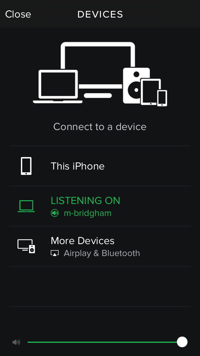
First, the good. Spotify’s ability to connect to other devices has been nothing short of amazing. I have seen iTunes talk to my Apple TV but Spotify’s seamless connection between my phone, desktop application, and Apple TV is superb.
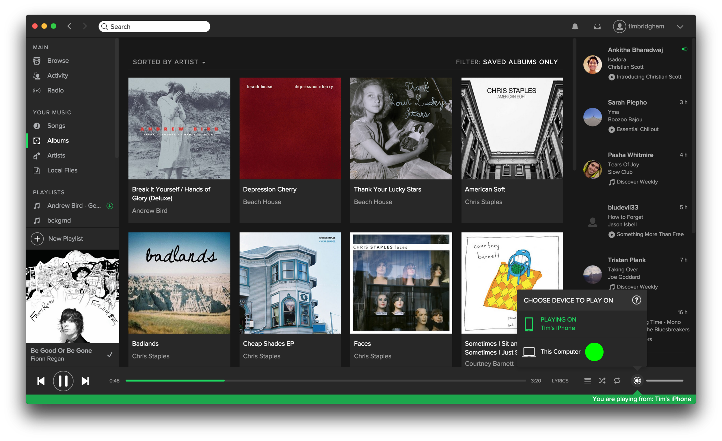
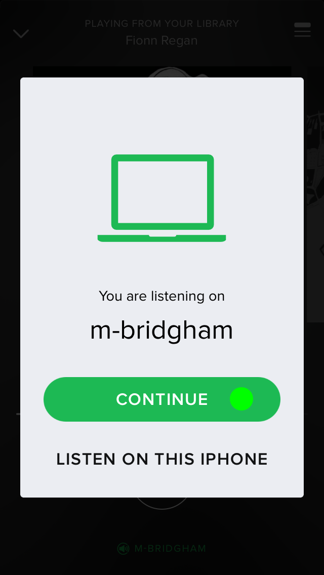
While playing a song in Spotify on my iPhone the desktop app shows me that I’m currently playing music from my phone and even gives real-time feedback as to where I am in the song. I can easily switch to playing the song from my computer with a few clicks on my computer and a few taps on my phone. The process is simple, straightforward, and perfect for controlling the music in the living from from your kitchen.
Second, the not-so-good. Spotify has many ways to enjoy the over 30 million songs it has. You can search for a specific song, artist, album, playlist, and more. Or you can browse curated playlists, the latest charts, new releases, and even more. There’s even a radio feature similar to Pandora. And lastly, you can manage your own library of saved playlists, songs, albums, artists, and still more. With all these great ways to experience content it is crucial that the information architecture or layout of each of these sections be optimal.
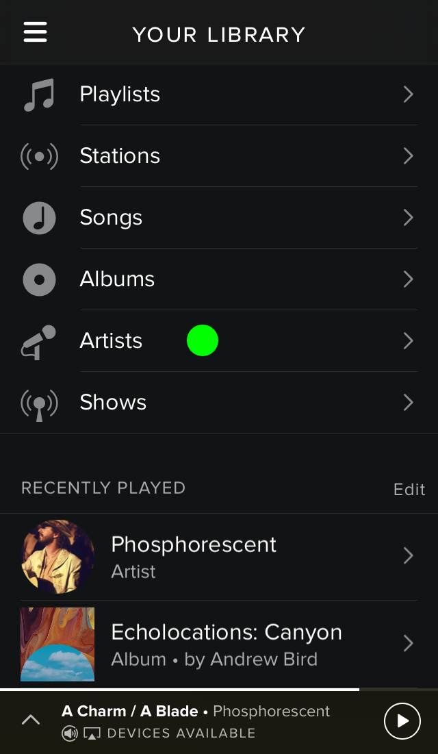
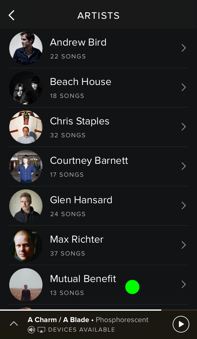
Current presentation of all music when selecting an artist to view.
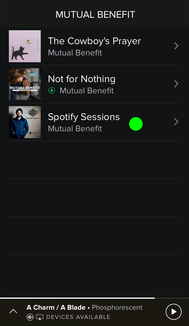
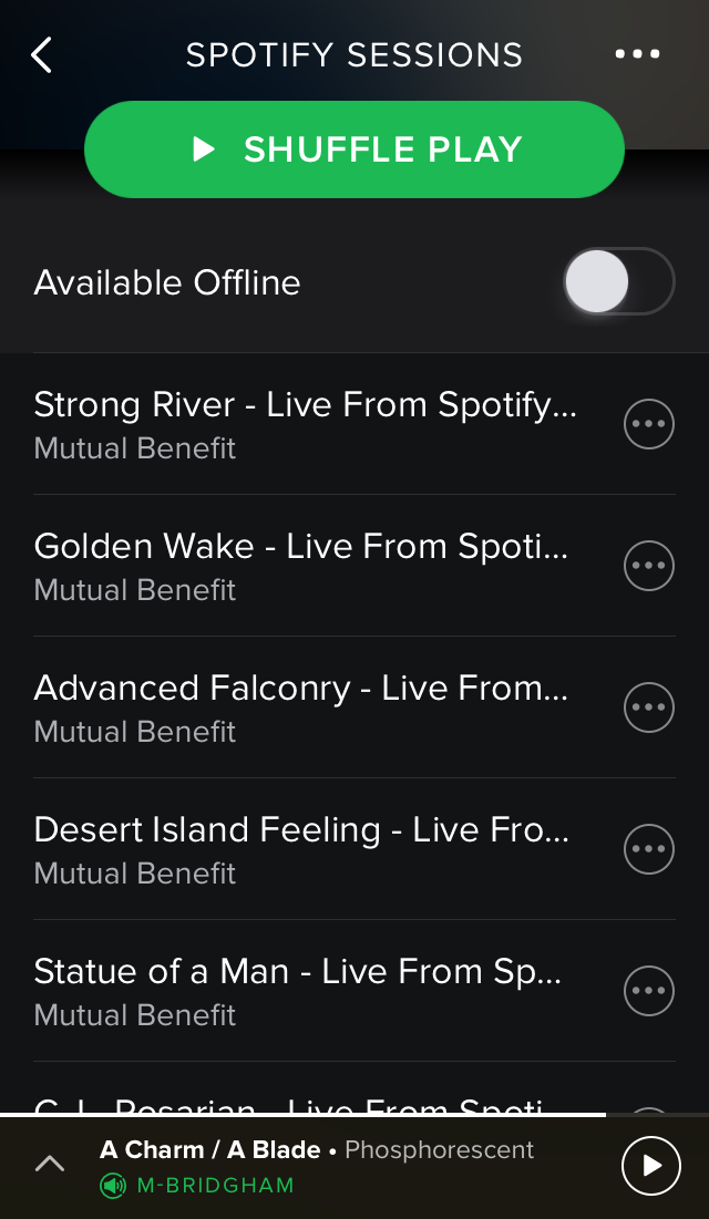
This is where I have an issue, particularly in the “Your Library” section. When I want to play an album, say the Spotify Sessions by Mutual Benefit, I have two ways in which I can get the album. The first would be to tap on the “Albums” section but then I am presented with a list of all the albums I’ve saved to my library (which can be sorted by artist or by album title). I’m then forced to scroll down to find the Spotify Sessions album I want to play. Secondly, I can tap on the “Artist” section and then tap on the artist Mutual Benefit but then I am presented with just a list of all the songs I’ve saved to my library. The songs are displayed in track order by album but there is no clear distinction between the end of one album and the start of the next. To make the process of selecting a specific album easier Spotify should present a list of the artist’s albums after you’ve selected a specific artist. This simple flow below illustrates the better experience I’ve proposed.
1. Tap Artists and present all artists saved to my library. 2. Tap Mutual Benefit and present all albums by Mutual Benefit saved to my library. 3. Tap Spotify Sessions and present the songs from that album (4).
Lastly, one (probably large) fix that could enhance Spotify for a small minority of users. According to the Pew Research Center, as of September 2014, 71% of online adults use Facebook so I know I’m in the minority as a young adult without a Facebook account. Because Spotify is highly integrated with Facebook this presents some headaches when using Spotify. Firstly, and more importantly, if a friend wants to follow me on Spotify they have to know my specific username and type the following in the search bar: “spotify:user:username” to find me. This hinders the social aspect that distinguishes Spotify from other streaming services. Secondly, and somewhat related, Spotify users whose accounts are not connected to Facebook cannot update their profile picture. This isn’t going to prevent me from using Spotify but more of a “nice feature to have.”
This has been my experience using Spotify and I know they come as a result of how I use the service. What has been your experience, either good or bad? Please leave a comment below.


